


Initial search experience
Burpple web platform had the most number of views, all coming from organic search.
Users visited the venue and the home page from Google search but didn't discover the rest of the Burpple platform or consumed merchant content.
While assessing the health of Burpple web and mobile platform using funnel analysis and combing through our Amplitude data, we found the following:
We had 95% drop off for user acquisition and 89% drop off for user activation. In short, users came to the venue page but didn't visit any other page or used our search feature.
Our aim of the initiative was to positively impact these numbers by improving the discoverability and search in the Burpple Web platform.
The design process we followed for this initiative was by creating hypothesis on why users didn't use search and designed solutions to cater to the hypothesis so that our user can discover more on the web platform.
And we used data to validate our hypothesis. We also realised this initiative would be give us a big win with lesser effort.
I led the design for search for web in collaboration with one other designer.
In addition, I worked alongside one Product Manager and Web Development team led by our CTO.
Diving deeper into our search flow for web and responsive we formed the hypotheses that our users might not be using search due to the following reasons:


Based on our assumptions we started creating improvement ideas for our search flow for the web. Few consideration we kept in mind:
We kicked off by creating low fidelity mockups as below:

With our initial wireframes and assumptions, we did user testing with our internal and external users.
Our findings:
Even though search was bigger on the web on the new designs, it was still not highlighted enough.
There was no push for the user and nothing to guide them to start searching.
We also realized, search was not the only way users could discover more on mobile devices.
Most of the menu options were hidden on mobile which hindered users to discover more.

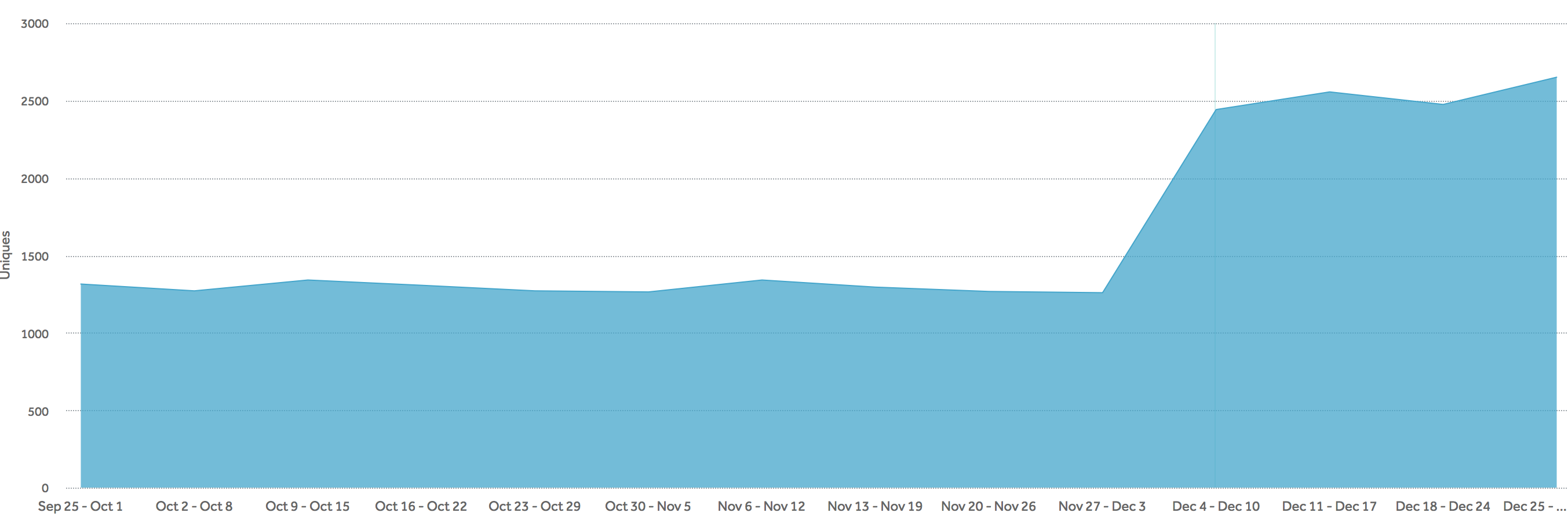
After the product development, the feature was launched in Dec 2017. We analysed the data we collected on Amplitude following the launch. The results are as below:
After the feature launch, we reached out to our users to gather more insights on how we can improve search further. A few pointers that we received:
Reduce the height of the search bar as the new design takes up important screen real estate on every page.
Show more discovery option for mobile pages.
The search results couldn't get specific venue names with special characters and numbers.
